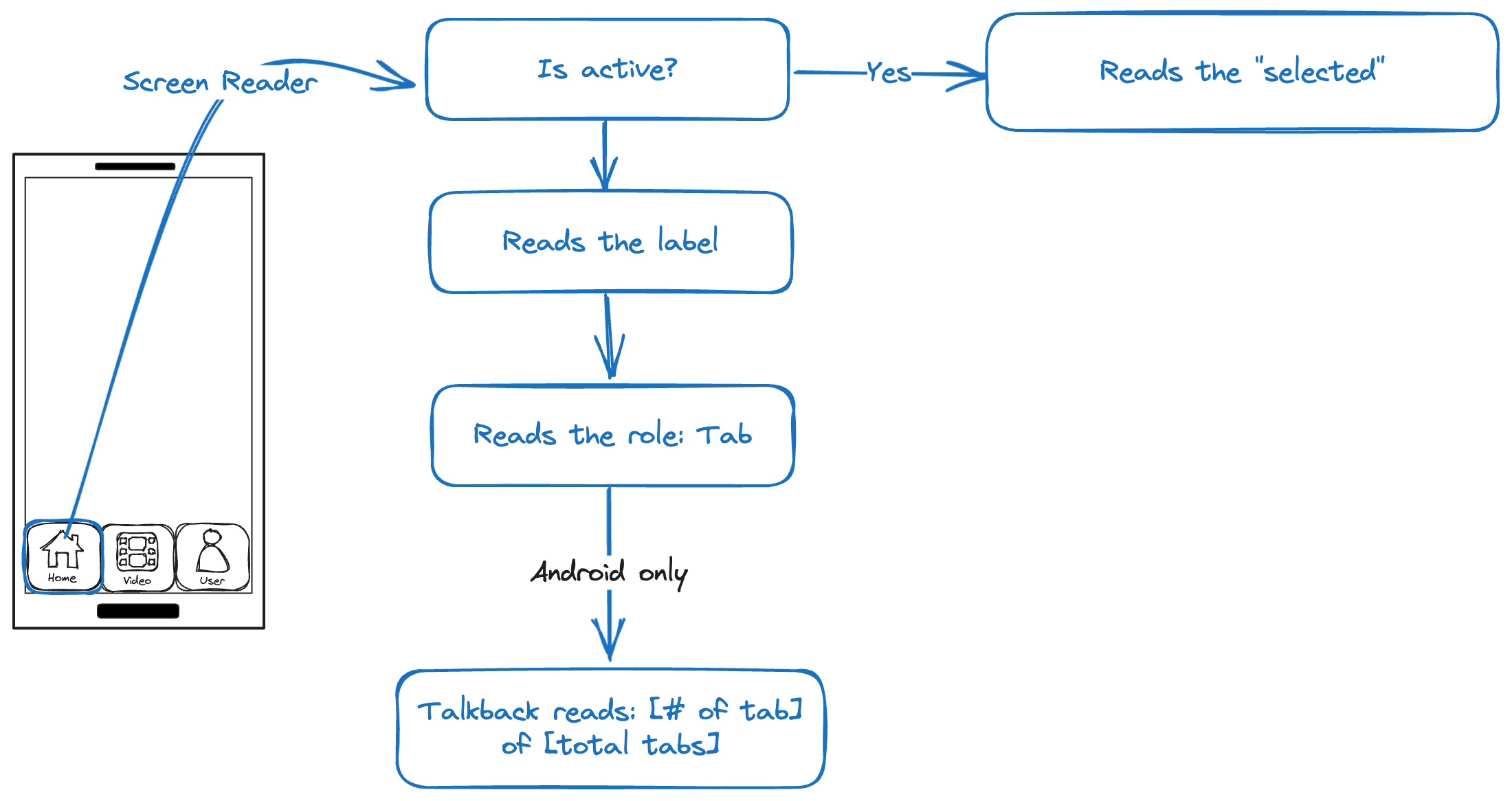
Bottom Tab Navigator

| Tab item | I see | I hear |
|---|---|---|
| Selected | Yes: Is visually clear that the tab is active | Yes: The Screen Reader reads the "selected" state |
| Label | Purpose is clear and matches visible label | |
| Role | The role: tab | |
| Talkback1 | [tab index] of [total] |
Testing
Procedures
- Turn on a Screen Reader.
- Move focus to the Tab navigator.
- Evaluate whether the label adequately and uniquely describes the component and clearly communicates its function.
- Verify whether the active state is announced appropriately.
Outcome
Ensure all the following checks are true:
- The label is clear and understandable.
- The component is announced as a "tab" by the screen reader.
- The selected tab is announced as "Selected" by the screen reader.
Example
| Voice Over | TalkBack |
|---|---|
| selected, Home, tab | selected, Home, tab 1 of 3 |
| Video, tab | Video, tab 2 of 3, double-tap to select |
| User, tab | User, tab 2 of 3, double-tap to select |
Footnotes
-
This behaviour is inherent only to Android. ↩